This was one of those flash obsessions that won't let go until they've forced you to give them form. I don't like keeping them inside (I always need the room for the next one that'll inevitably come along). I've always liked Celtic knotwork anyway.
The font was made with METAFONT. The algebraic relations and equation solving features of Knuth's program really shine in knotwork drawing.
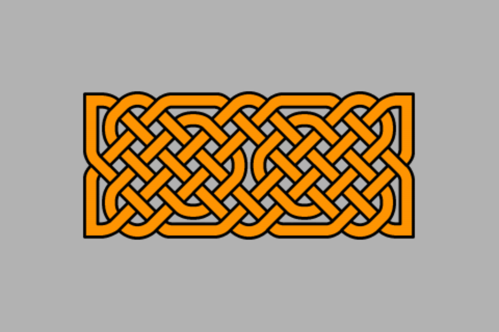
Here is a really nice single-strand knot. Proper celtic knots can be very intricate, but are always made up of a single strand.

Celtic Knot example.
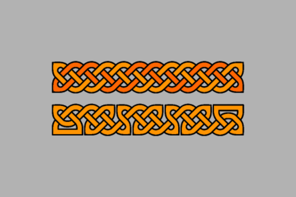
A couple of crappy knots I made during testing. These are not single strands. Like I said— crappy. The font helps a lot, but it won't do everything for you. The top one is a nice, two-strand knot, but overly simplistic. The bottom one is much nicer and less symmetrical, but has too many strands (a nice long one and three short rings).

Another example of a Celtic Knot. The top one is made of two strands; the bottom one is a single strand.
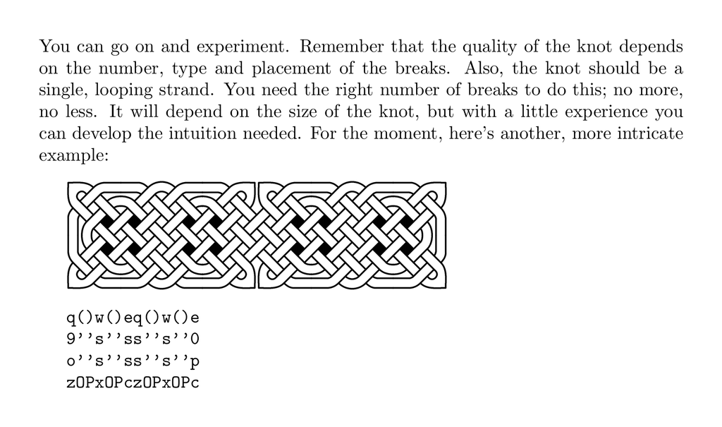
And here's part of the (never completed) documentation on how to use the font.

A page from the documentation, showing the latin-to-knot mapping, in traditional TeX style.
The main reason I never bothered continuing this project is one obvious to any who've used METAFONT—even though it's an impressively simple tool for making such designs, it can only create bitmap fonts. Even in 2003, bitmap fonts were a quaint thing of the past and had limited uses.